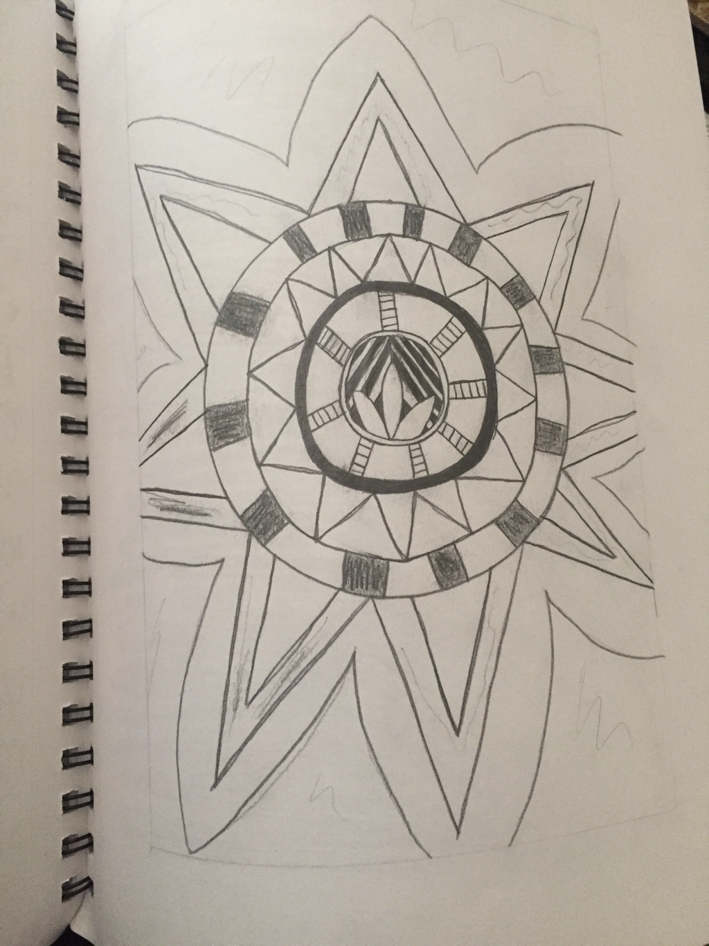
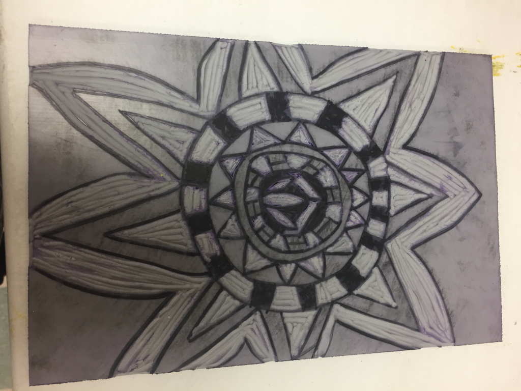
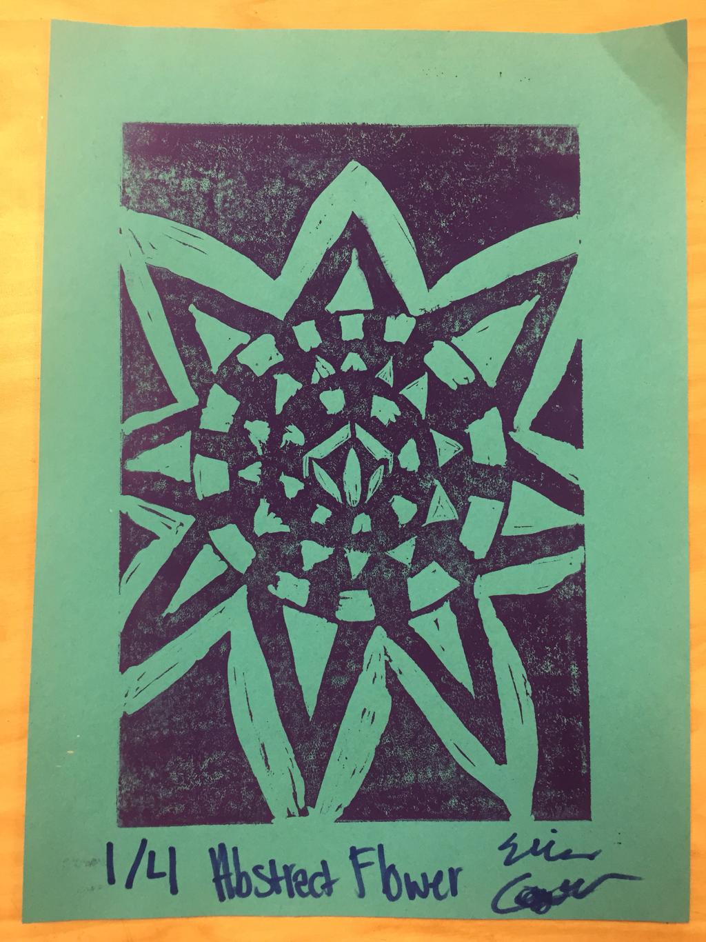
   1. My piece shows off the theme of line because of all the lines used to create the shapes inside and the line details.
2. I think that my piece was successful by the way that I was able to cut the lines/shapes out so they were pretty clear. If i could do anything different I might try to change the design. I think that it would look cool and different if I had done it opposite so there was a simple design cut out and the rest was black.
0 Comments
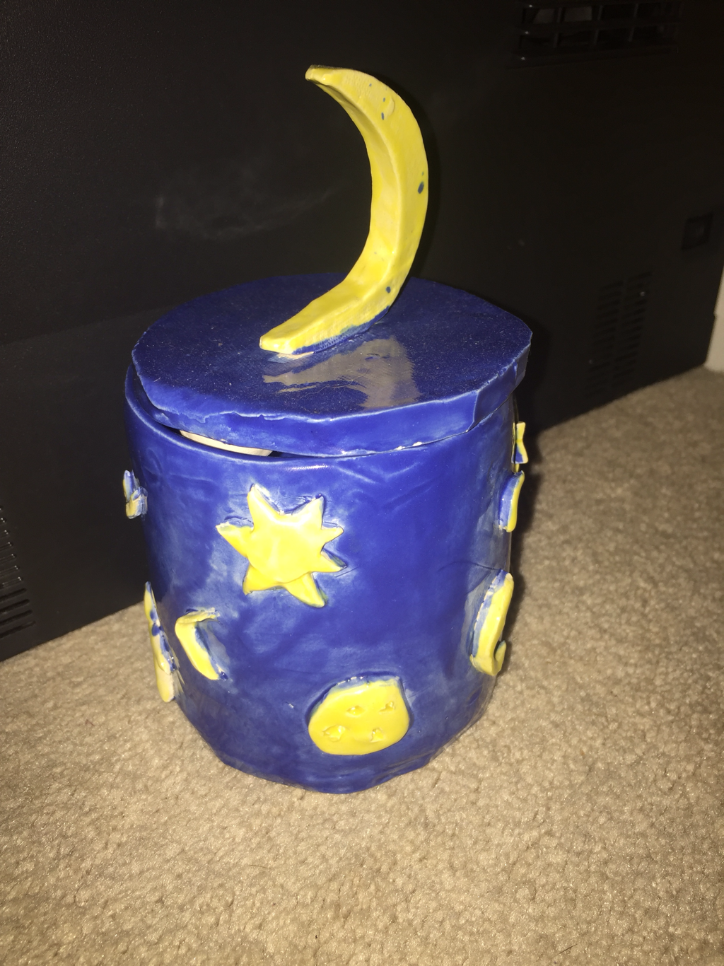   1. I have now finished glazing my piece. It was fired in the kiln and now shiny and the colors of the glaze look more vibrant. I think the finished piece turned out well.
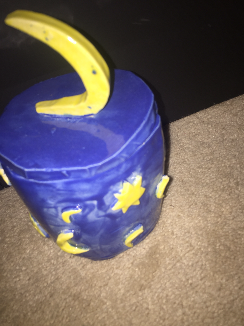
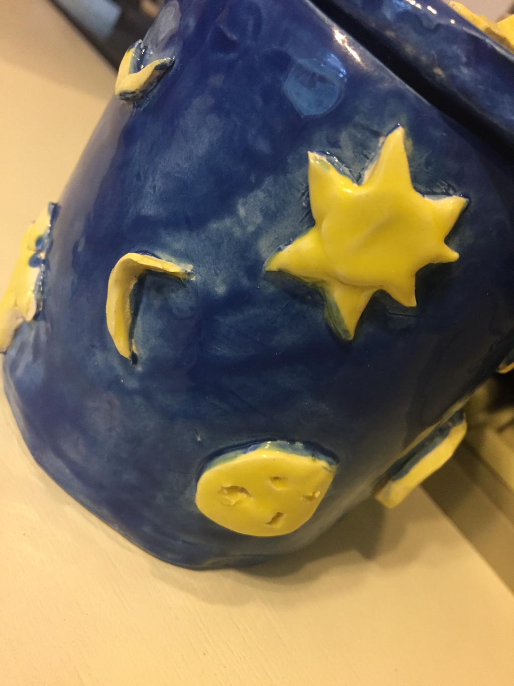
2. I find the designs on the outside successful. I like how the suns and moons look on the outside and I think it looks cool and pretty. It had ended up turning out better than I expected. 3. If I were to do this again, i might have made some more space shapes and more colors to make it look more like that and maybe would've make the handle better. 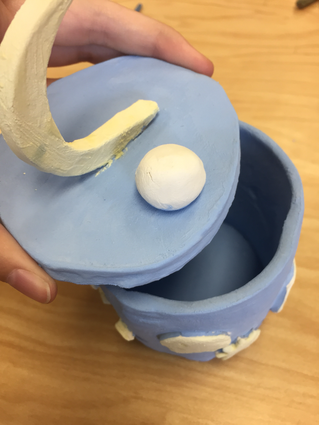 1. I plan to make my piece look somewhat celestial. I will make clay moons and suns. I will then paint the whole thing blue except the suns and moons yellow.((don't have earlier in progress picture))
2. I have found it difficult to make the lid. It was hard to make it the exact same shape as the box. It was also kind of difficult to keep on cutting out all the small little pieces. 3. So far what I find successful is that most of the suns and moons that I am making are turning out to look good and the whole thing has a nice theme. 4. I had first rolled out slabs of clay to shape the actual box, the bottom of the box, and the lid. I used the process of scratch and slip to put together all of the pieces like attach the bottom to the box and to attach the suns and moons to the piece. The piece was green ware when i was making everything for it. It is currently at bisqueware because it has been fired and i'm now glazing it.  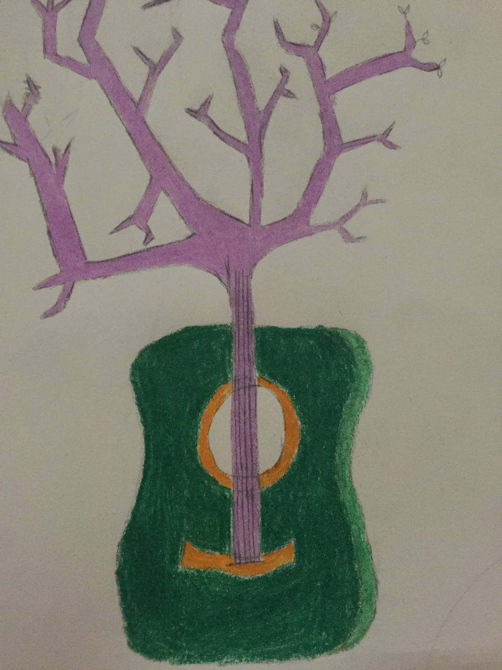 IN PROGRESS PICTURE^ 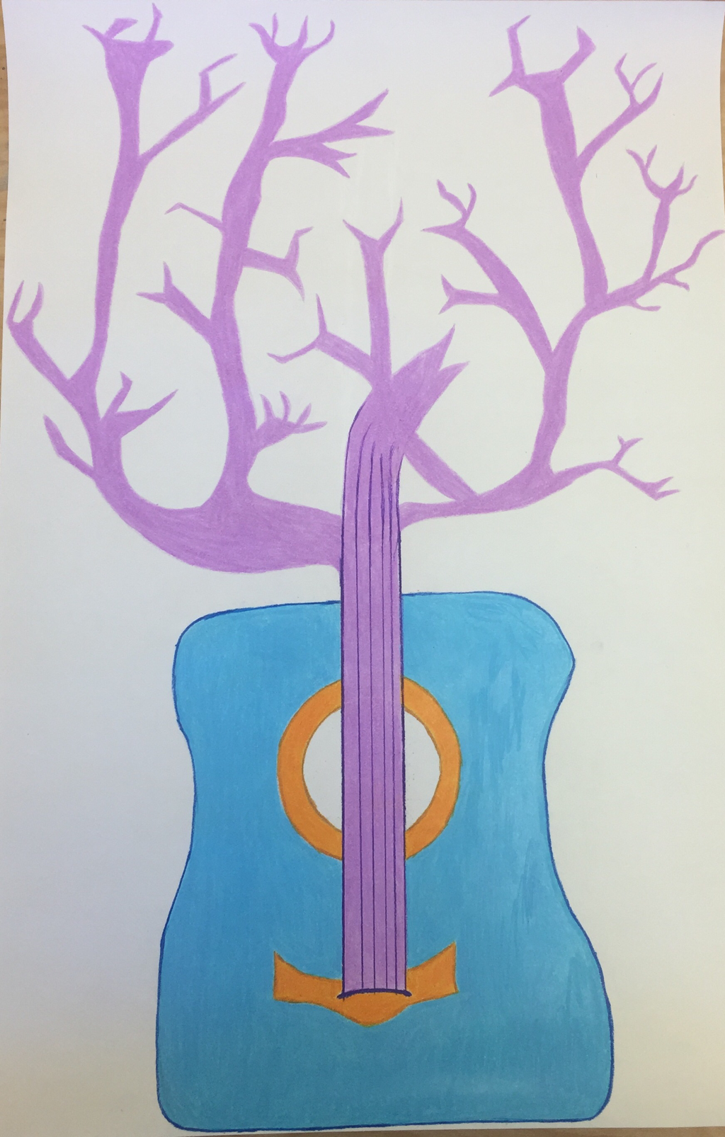 FINISHED PIECE 1. The medium I decided to use was colored pencil. I like that I could use such bright and intense colors and I liked how i could get a really good finish with them.
2. In my two in one piece I put together a guitar and a tree. 3. I looked at a lot of pictures of two in one pieces and I found a lot of inspiration from them. I saw a picture of fingers combining with trees and i thought it looked cool so i did something similar but with the guitar. It took a while to keep layering the colored pencil but I liked how it ended up turning out.   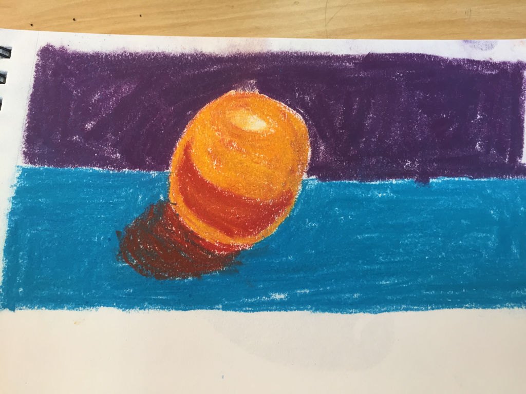 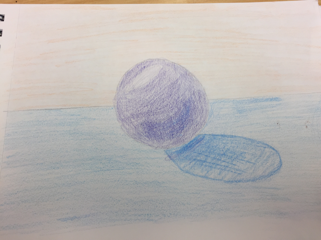   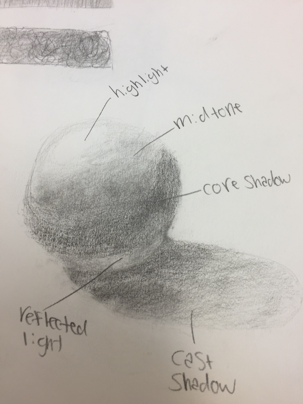 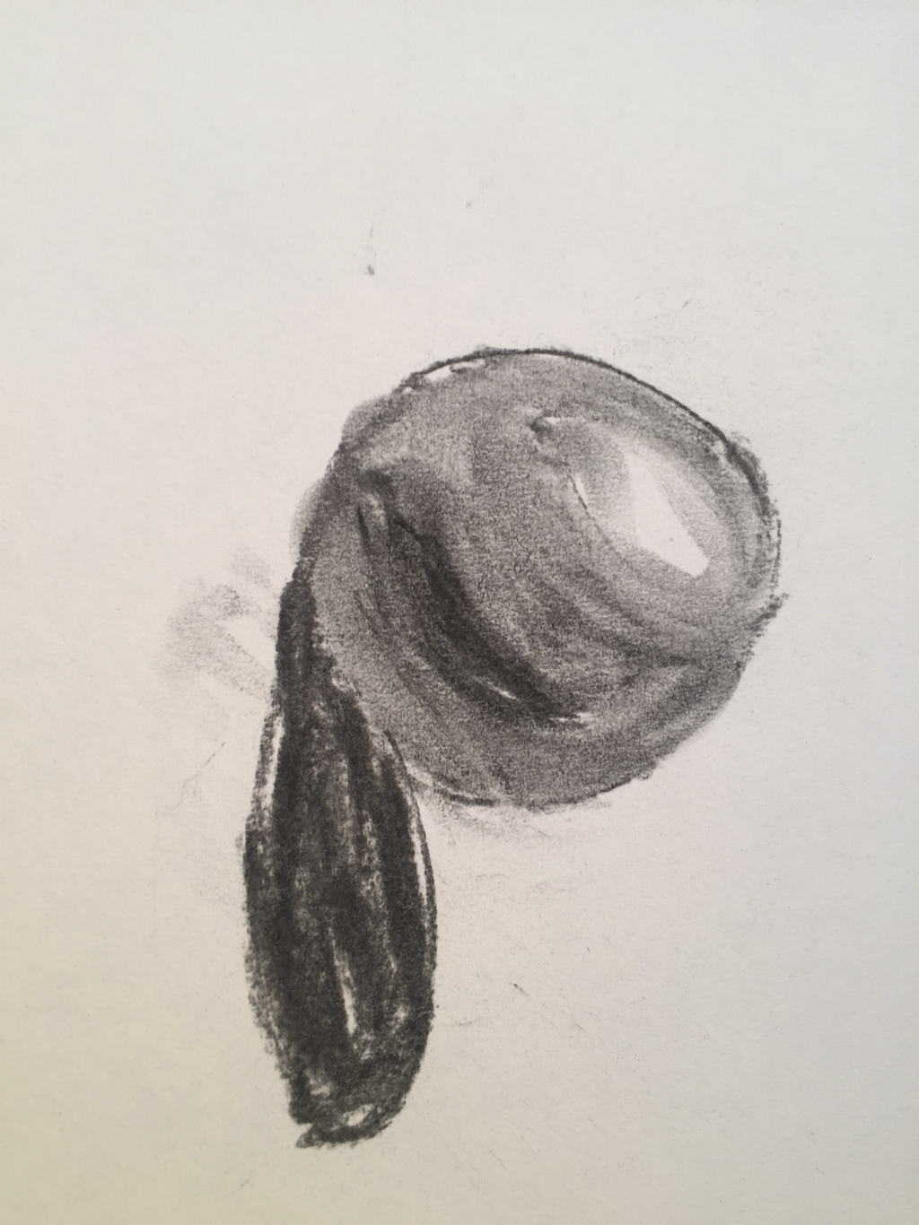 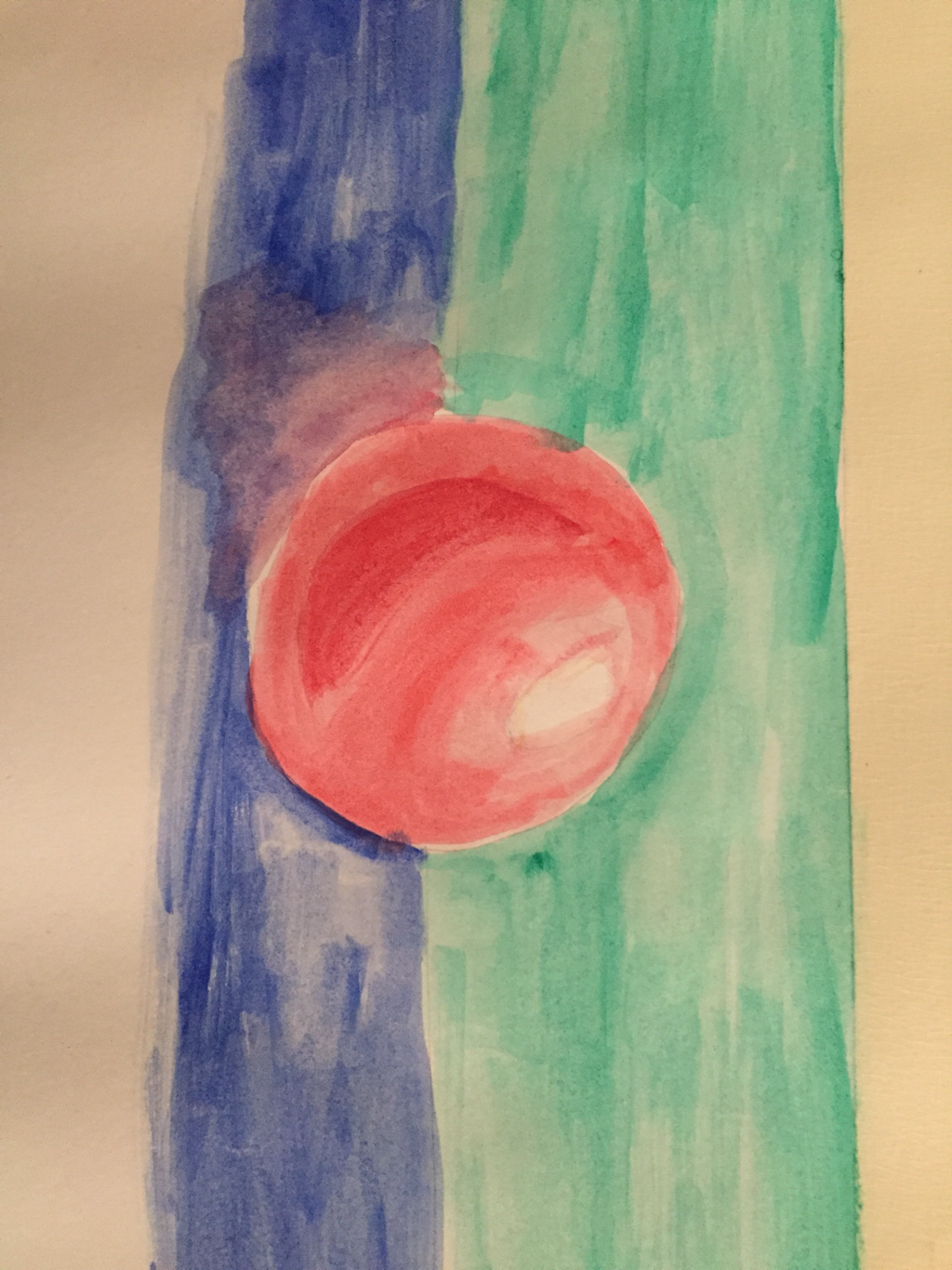 1. I think that my favorite medium was the oil pastels. I like that they blended pretty well and I think it's my best looking sphere. It's also very smooth and I like how it feels drawing with it.
2. I think that my least favorite medium to draw the spheres with was the colored pencil. I didn't think that my sphere turned out that good with it and I also found that it was a lot harder to blend everything out. 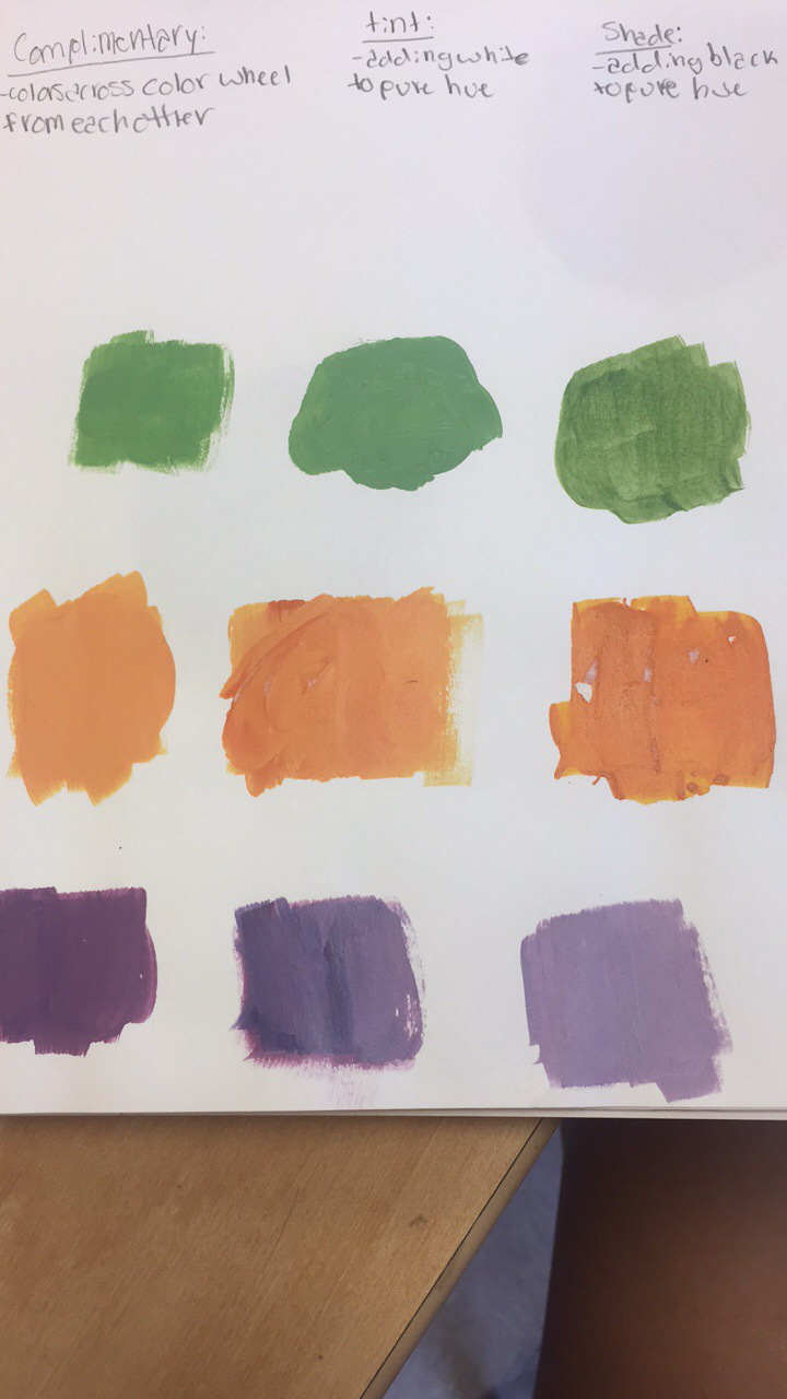 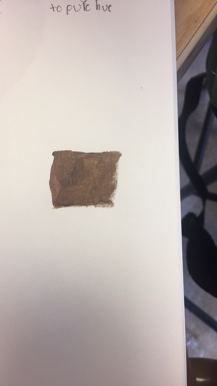 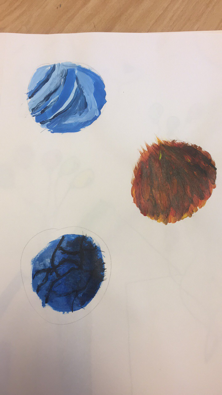 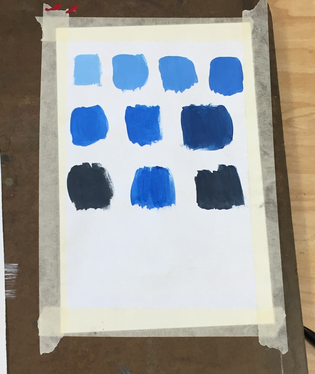 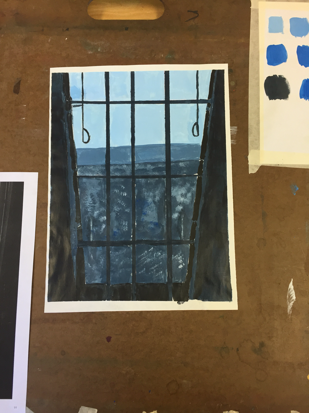 1. It was kind of hard for me to mix the color swatches because it was hard to get the exact color I wanted and I had to figure out which colors and amounts of them to mix.
2. You make the color brown by mixing all three primary colors- red, yellow, and blue. 3. I chose to paint a picture I took look out the window in a lighthouse at the Outerbanks because I thought it was a pretty picture and that it would be cool to paint it and i liked the factor of the straight lines used for the window section. 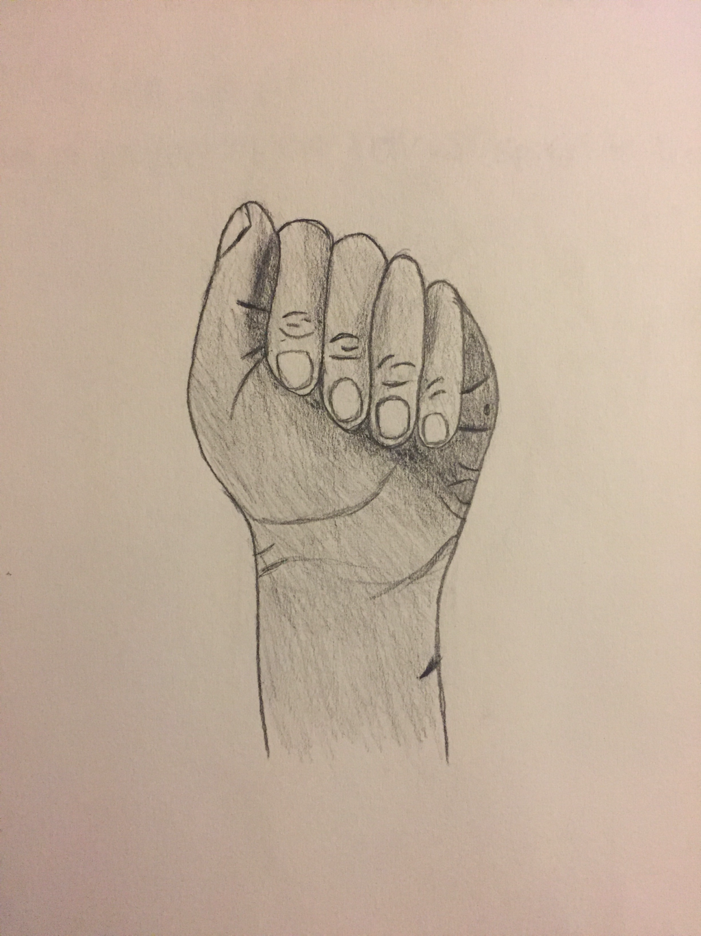    1. I think that the sign language A warm up has been the most helpful during this unit. I think that it helped me a lot with getting in small details and shading it right. I'm usually not very good at drawing hands and I think that this had helped me improve a lot. 2. Composition: the placement or arrangement of visual elements or ingredients in art. Value: element of design that defines the light and darks in an artwork. 3. Pencil- Pros: it is probably one of the easiest mediums to use, if you mess up it is erasable, no drying time. Cons: needs to be sharpened frequently, might smudge too easily, better for smaller drawings not bigger ones, could break easily. Charcoal- Pros: quicker than pencil, smudges easily, can get a very dark color easily. Cons: smudges easily, very sensitive, have to use something so it doesn't get messed up when you're finished, messy. Pen- Pros: can get precise lines, can sometimes look better, smoother and darker than pencil. Cons: not erasable, doesn't shade as well as pencil.
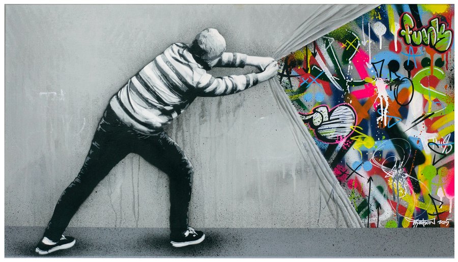
Martin Whatson is a a Norwegian born and stencil based artist. He studied Art and Graphic design at Westerdals School of Communication, Oslo. He started his own stencil production in the winter of 2004. He looks for inspirations in people, city landscapes, old buildings, graffiti, posters and decaying walls.
http://martinwhatson.com/
|
AuthorWrite something about yourself. No need to be fancy, just an overview. ArchivesCategories |
 RSS Feed
